
Digital accessibility: what are the best practices?
About 15% of the world's population lives with a disability according to the World Health Organization. Unfortunately 70% of digital content remains inaccessible to them.
What is an accessible website?
The Web Accessibility Initiative (WAI) created by the World Wide Web Consortium defines accessibility as follows:
"Web accessibility" means that websites, tools, and technologies are designed and developed so that people with disabilities can use them. Specifically, people can:
- perceive, understand, navigate, and interact with the Web
- contribute
Accessibility covers a broad spectrum of functional limitations, such as visual, auditory, physical, cognitive, neurological, speech, language and learning limitations.
But in the end people quickly realized that web accessibility also benefits abled people.
For example:
- People using cell phones, smart watches, smart TVs and other devices with small screens, different input modes, etc.
- seniors whose abilities change as they age
- people with "temporary limitations" such as a broken arm or who have lost their glasses
- people with "environmental limitations", such as exposure to sunlight or in an environment where they cannot listen to audio
- people with a slow Internet connection or with limited or expensive bandwidth
The goal is therefore to exclude or limit the obstacles that hinder access to a web page in order to offer equal access to all and without discrimination.
For norms and standards, we need to refer to the WCAG 2.0, the authority in this field. This standard is based on 4 objectives. The content must be:
- Perceivable: play with contrasts, make text visible and add a textual alternative to non-textual elements
- Operable: make content accessible by keyboard or mouse, browsing aids
- Understandable: produce readable content, help surf and make it intuitive
- Robust: provide accessibility regardless of the tool and technology used
Web accessibility: who does it concern?
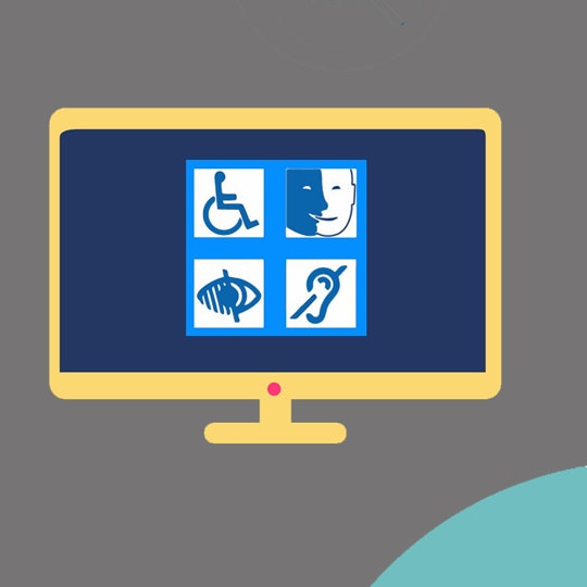
People with disabilities are among the users particularly concerned with web accessibility. When creating or redesigning a website, it’s important to think about the impact for each form of disability: visual, auditory, physical and neurological.
Even if people with disabilities are the first to be affected, accessibility can be broadened to mean access for the greatest number of users.
Put yourself in the shoes of people with disabilities and understand how they navigate the Web
People who are blind, use screen readers (a technology that synthesizes the content of a web page). To quickly find the right content, a screen reader analyzes the site navigation and headers of each page. It is combined with a keyboard rather than a mouse or touchpad: the Tab and Enter keys allow to quickly switch between the active elements of a page. This is why a person who is blind must be able to rely on perfectly structured content and clear navigation to access the Web.
Visually impaired or colorblind individuals, unlike people who are blind, browse your site in a "classic" way... but are hindered by a host of obstacles. Fonts that are too small, information that is based solely on color (e.g., histograms or blue hyperlinks)...
Luckily, there are solutions:
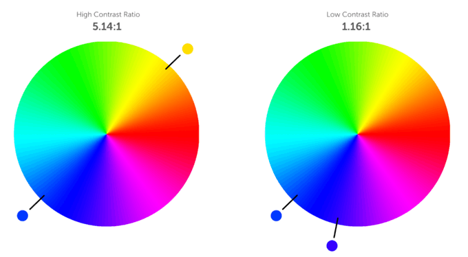
1.Contrast RatioThe contrast ratio is a value between 1 and 21 (1 = same color, 21 = black/white) that determines the quality of the contrast between the text and its background. An accessible contrast ratio helps people with visual impairments to interact. The accessible contrast ratio is generally 4.5:1 (except for enlarged text and enlarged text in image form that have a contrast ratio of at least 3:1).
2. Navigation, content hierarchy and headers
As mentioned previously, when the content is structured and clear, the user experience is greatly improved, especially since he can easily interact with the different elements of the site.
3. Text and typography
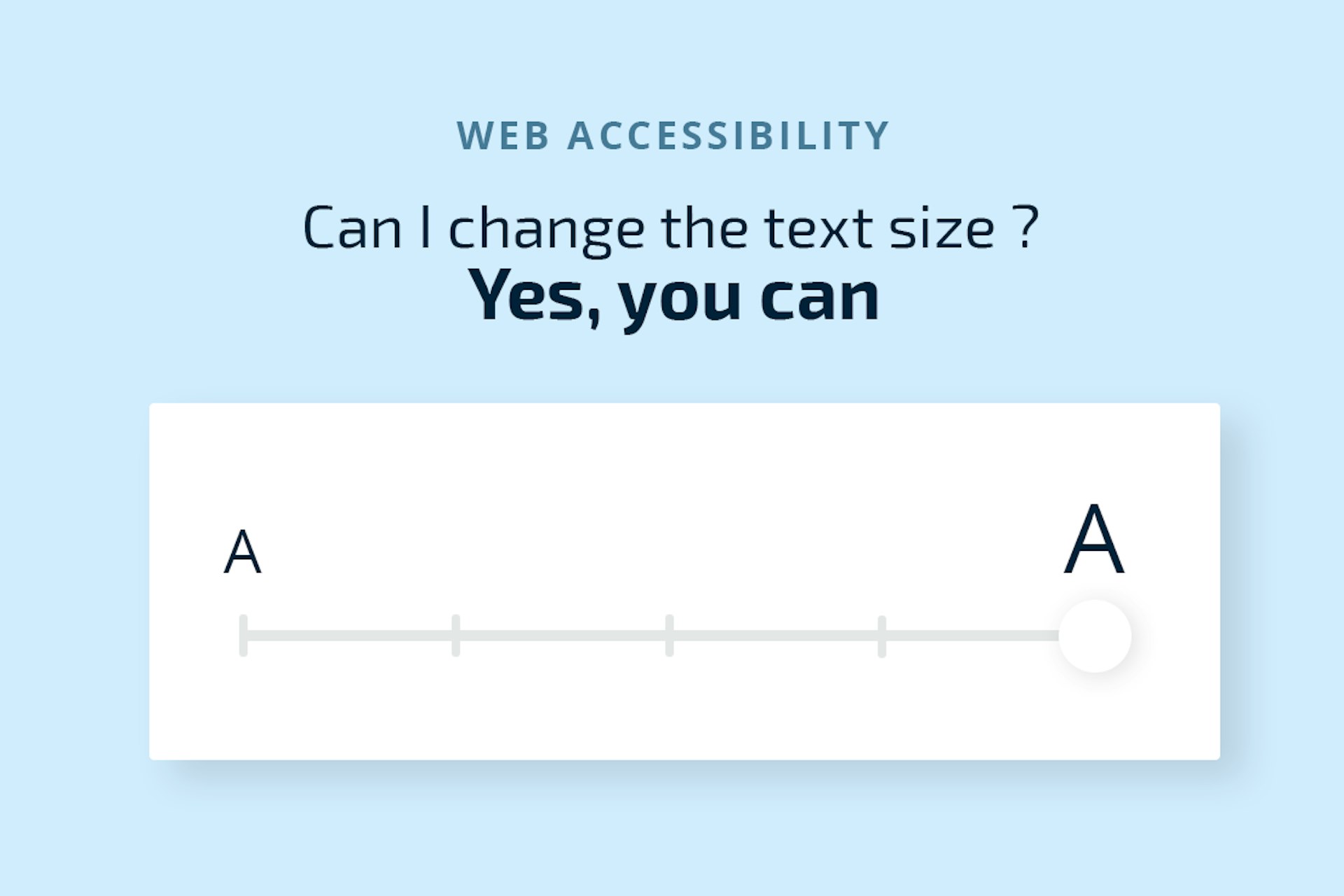
Text size: small texts are difficult to read for visually impaired people. Using a font size of at least 14 px on the site allows access to as many people as possible. At the same time, the text should be resizable up to 200 percent.
Alignment: Text should never be justified. Constrained in a limited space, justified text will have spaces of varying width between characters, and the user will have difficulty distinguishing the beginning or end of a word. Left-aligned text is the best option.
Spacing: Spacing helps the user identify the text to be read, but also where to start reading.
Capital letters: Some text readers spell out words in capital letters, making it less easy to understand. Therefore, make sure to use lower case text (except for the first letter of words).
4. Alt Text
Alt Text provides the user with basic but essential information about an image. This makes images accessible to users of screen readers, but also to those suffering from slow connections - when images cannot be loaded.
For the hearing impaired, it is important to caption video content. It is also important to keep in mind that it is not only the hearing impaired who view content with the sound turned off. The media are on point when it comes to offering videos with embedded text.
For people with physical disabilities, it is important to check the formatting of web forms, payment gateways and other login fields so that the autofill tools can fill in the information. You should be able to browse a website using only the Tab, Shift, Space and Enter keys.
Tab: allows you to loop through all the interactive elements of a page (from top to bottom)
- Shift + Tab: allows you to loop through all the interactive elements of a page (from bottom to top)
- Enter / Space: allows you to interact with the content (click on a link, check a box or display a drop-down menu)
Finally, for cognitive disorders, a clear visual layout and structured navigation is recommended. The use of icons and visuals should facilitate understanding for all.
Conclusion
In summary, when we embark on an accessibility process, it goes beyond the disabled public. It is in fact a question of disseminating your content to a maximum number of Internet users. The recommendations of the WAI (W3C) and in particular the WCAG 2.0 are guidelines that can be followed. All other standards are based on them.
Remember that in any case, an accessible online experience naturally generates less friction and frustration. A website that you can easily browse and with quality and structured content will be more favored by Google referencing. The notion of accessibility is closely linked to the user experience on a website (UX) and to the ergonomics of its interfaces (UI). We will develop this theme in a future article.